
HomeShop

#InspirasiWarna

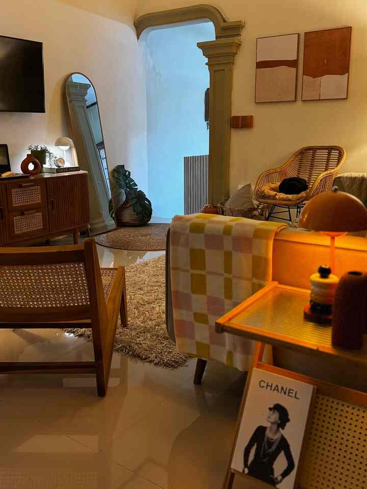
The color palette chosen for PearlHouse is earth tone colors, such as dark brown, light brown, beige, terracotta, sage and white, hopefully inspiring ✨

#scandinavianinterior
#LivingroomPaintColors
#HomeColorPalette
#ColorInspiration
#woodenfurniture
#tablelamps
7
The color palette chosen for PearlHouse is earth tone colors, such as dark brown, light brown, beige, terracotta, sage and white, hopefully inspiring ✨ #scandinavianinterior #LivingroomPaintColors #HomeColorPalette #ColorInspiration #woodenfurniture #tablelamps
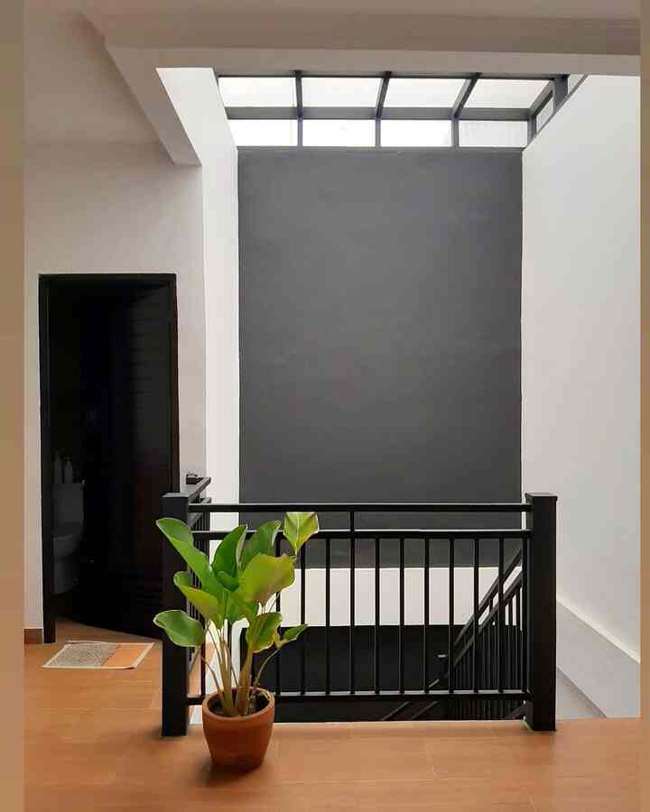
While most houses choose white or cream wall paint to match the wooden interior inspired by Korean houses, I prefer to use bold colors such as black, sage which of course is combined with white as a balance so it's not dark. 
Why bold colors? Because I like experimenting with colors that are outside of people's habits & just make them more eye catching 

#ChooseHomeColor #HomeColorPallete #RekomendasiWarnaRumah #renaiput #interiormodern #inspirasiwarna
4
While most houses choose white or cream wall paint to match the wooden interior inspired by Korean houses, I prefer to use bold colors such as black, sage which of course is combined with white as a balance so it's not dark. Why bold colors? Because I like experimenting with colors that are outside of people's habits & just make them more eye catching #ChooseHomeColor #HomeColorPallete #RekomendasiWarnaRumah #renaiput #interiormodern #inspirasiwarna
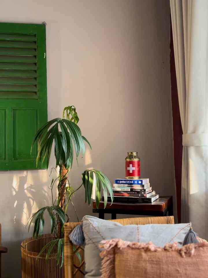
The color palette in this house carries warm colors,
bold. This room does not follow existing color trends, everything starts from personal color choices and wants to convey a unique and comfortable impression in this house.

Burgundy is also a derivative color, white with a mixture of purple, making the main color of burgundy remain on point!

Combined with natural color elements such as brown wood and plants, it makes this room more cozy and humble.

#bringcolorstomyhome #homecolorpalette #paletwarnarumah #rumahsederhana #livingroom #inspirasiwarna #trendcolor
4
The color palette in this house carries warm colors, bold. This room does not follow existing color trends, everything starts from personal color choices and wants to convey a unique and comfortable impression in this house. Burgundy is also a derivative color, white with a mixture of purple, making the main color of burgundy remain on point! Combined with natural color elements such as brown wood and plants, it makes this room more cozy and humble. #bringcolorstomyhome #homecolorpalette #paletwarnarumah #rumahsederhana #livingroom #inspirasiwarna #trendcolor