
HomeShop

#InspirasiWarnaRumah
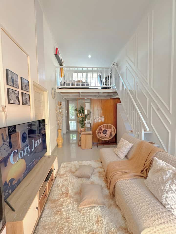
── Color Palette 🤍🤎 ──

This house is predominantly using earth tone colors,
We use neutral colors to give a bright impression so that this small house looks warm and more spacious.

#MinimalistHousePaint #WarnaCatRumah
#HomeColorPalette
#HomeColorInspiration #RumahMezzanine
4
── Color Palette 🤍🤎 ── This house is predominantly using earth tone colors, We use neutral colors to give a bright impression so that this small house looks warm and more spacious. #MinimalistHousePaint #WarnaCatRumah #HomeColorPalette #HomeColorInspiration #RumahMezzanine
Palette Color 🎨 
-
🤍🩶🖤
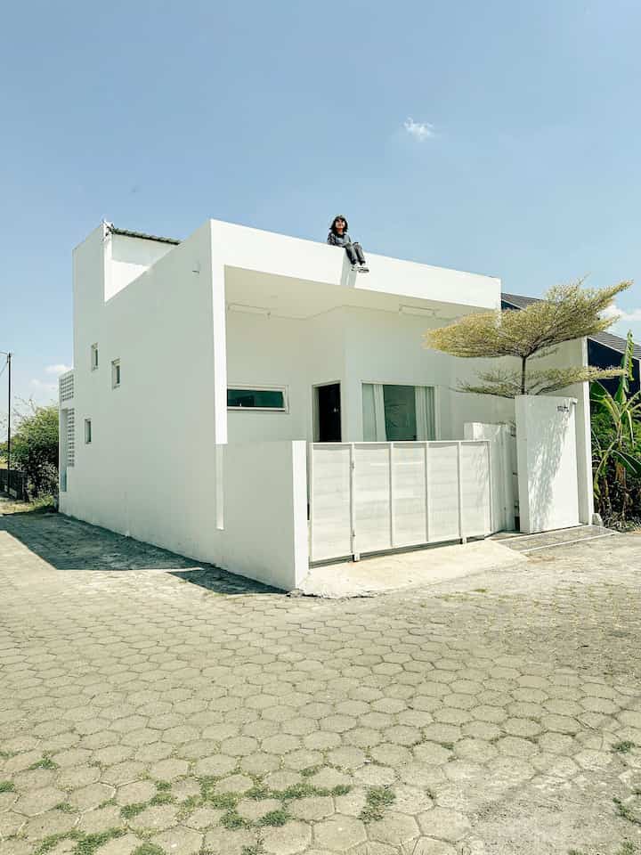
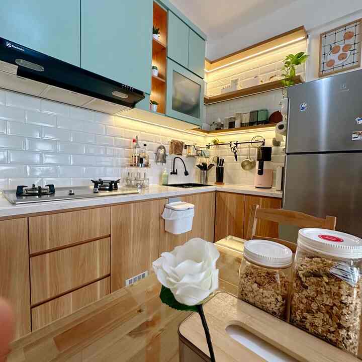
we choose neutral colors that are predominantly white to give a spacious impression because the width of the house is only 45m2
-
selection of furniture colors is not far from white, gray and black, because we want a minimalist concept
-
tips for creating a minimalist room
determine the shape of the object (square, round or other symmetrical)
choose a maximum of 3 colors and combine them with a color level that is not too contrasting (example: light pink, look for light pink derivatives so that they are similar)
choose furniture with a continuous / rigid shape so that it can be a geometric shape with the others

#MinimalistHousePaint #WarnaCatRumah #CatLuarRumah #CatPutih #HomeColorPalette #InspirasiWarnaRumah #minimalis #rumahidaman #rumahminimalis #white #aesthetic #homedecor #angkahouse
8
Palette Color 🎨 - 🤍🩶🖤 we choose neutral colors that are predominantly white to give a spacious impression because the width of the house is only 45m2 - selection of furniture colors is not far from white, gray and black, because we want a minimalist concept - tips for creating a minimalist room determine the shape of the object (square, round or other symmetrical) choose a maximum of 3 colors and combine them with a color level that is not too contrasting (example: light pink, look for light pink derivatives so that they are similar) choose furniture with a continuous / rigid shape so that it can be a geometric shape with the others #MinimalistHousePaint #WarnaCatRumah #CatLuarRumah #CatPutih #HomeColorPalette #InspirasiWarnaRumah #minimalis #rumahidaman #rumahminimalis #white #aesthetic #homedecor #angkahouse
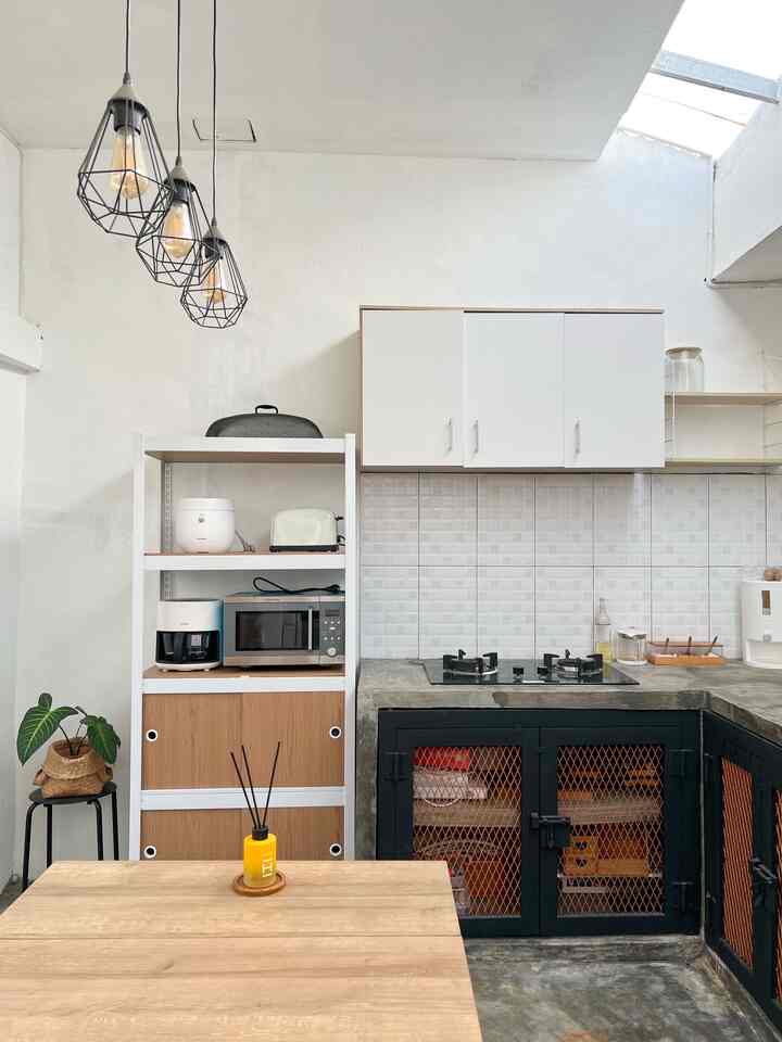
If you talk about the problem of the color used in my apato, actually there are not many colorful colors. Because all the walls are white, but in some rooms I gave contrasting paint colors. ✨✨

Well, according to me, if the size of the space is limited, it's better to use white or not many colors to make it look spacious. But just 1 other color is enough to give a clear "statement" to the room. For example, it's like the living room that I painted green on 1 side. ✨✨

You can also use colorful decorative products so it's not boring.💜💜

#bubuapato #HomeColorPallete #InspirasiWarnaRumah #WarnaCatRumah #WarnaCatRuangTamu #WarnaDapur #WarnaCatRuangKerja #Cat
4
If you talk about the problem of the color used in my apato, actually there are not many colorful colors. Because all the walls are white, but in some rooms I gave contrasting paint colors. ✨✨ Well, according to me, if the size of the space is limited, it's better to use white or not many colors to make it look spacious. But just 1 other color is enough to give a clear "statement" to the room. For example, it's like the living room that I painted green on 1 side. ✨✨ You can also use colorful decorative products so it's not boring.💜💜 #bubuapato #HomeColorPallete #InspirasiWarnaRumah #WarnaCatRumah #WarnaCatRuangTamu #WarnaDapur #WarnaCatRuangKerja #Cat
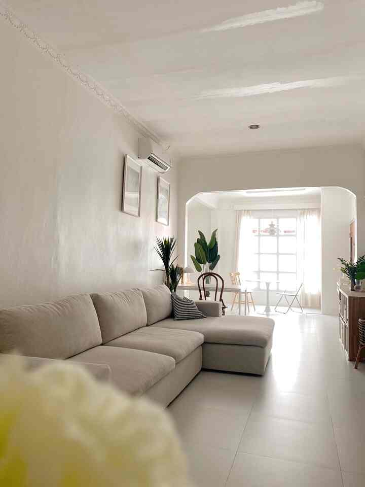
Neutral Color Palatte was chosen for this house. So that it doesn't seem too crowded and the room feels more spacious

#ChooseHomeColor #HomeColorPalatte #RekomendasiWarnaRumah #PaletWarnaRumah #InspirasiWarnaRumah
4
Neutral Color Palatte was chosen for this house. So that it doesn't seem too crowded and the room feels more spacious #ChooseHomeColor #HomeColorPalatte #RekomendasiWarnaRumah #PaletWarnaRumah #InspirasiWarnaRumah
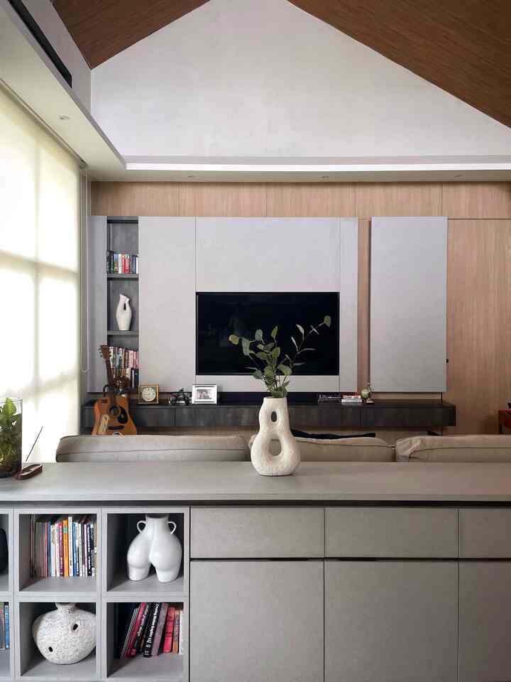
Color palette..you can guess it at first glance..because I chose minimalist, the color palette I chose was dominated by white..I added other colors like black, wood, gray as accents..to make the room more lively, I also added some artificial plants :) #CatRumahMinimalist #WarnaCatRumah #HomeColorPalette #InspirasiWarnaRumah #homeinspo #livingroom #minimalist
4
Color palette..you can guess it at first glance..because I chose minimalist, the color palette I chose was dominated by white..I added other colors like black, wood, gray as accents..to make the room more lively, I also added some artificial plants :) #CatRumahMinimalist #WarnaCatRumah #HomeColorPalette #InspirasiWarnaRumah #homeinspo #livingroom #minimalist
⭐️Home Color Palette⭐️

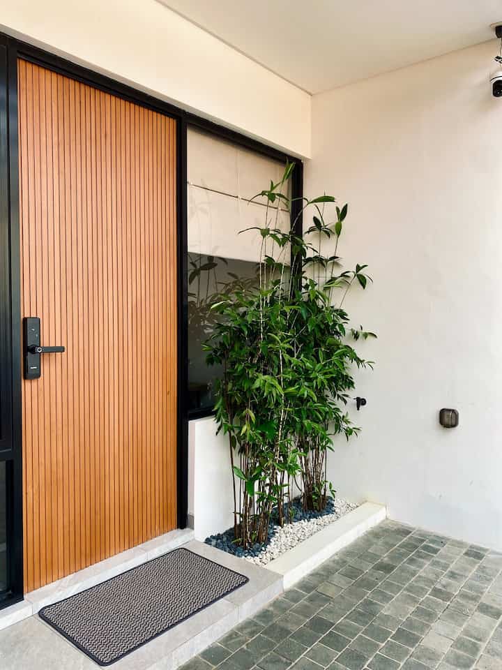
The color palette in rumahpojok mostly uses earth tone colors, dominated by light brown wood color japandi with a combination of gray.

For new decorations using additional colors, for example on the carpet using a combination of gray and dark blue to make it more lively. For the walls of the house using ivory white textured paint.

I chose earth tone colors for the entire color palette to make it easy to mix and match and be creative with furniture and other decorations.
_
#HomeColorPalette
#HomeColorInspiration
#HomePaintColor
#homestyling
#minimalistmodernhome
#Jaapndimodern
5
⭐️Home Color Palette⭐️ The color palette in rumahpojok mostly uses earth tone colors, dominated by light brown wood color japandi with a combination of gray. For new decorations using additional colors, for example on the carpet using a combination of gray and dark blue to make it more lively. For the walls of the house using ivory white textured paint. I chose earth tone colors for the entire color palette to make it easy to mix and match and be creative with furniture and other decorations. _ #HomeColorPalette #HomeColorInspiration #HomePaintColor #homestyling #minimalistmodernhome #Jaapndimodern
Color palette ✨

The color palette in this work spot area is dominated by earth tones and neutral colors, the choice of colors greatly influences the impression of spaciousness and homey.

#Wallpanel
#NippontPaint
#HomeColorPalette
#HomeColorInspiration
#WorkDesk
#FavoriteSpot
#aesthetic
4
Color palette ✨ The color palette in this work spot area is dominated by earth tones and neutral colors, the choice of colors greatly influences the impression of spaciousness and homey. #Wallpanel #NippontPaint #HomeColorPalette #HomeColorInspiration #WorkDesk #FavoriteSpot #aesthetic
Color Palette 🖤🤎🤍🧡💚

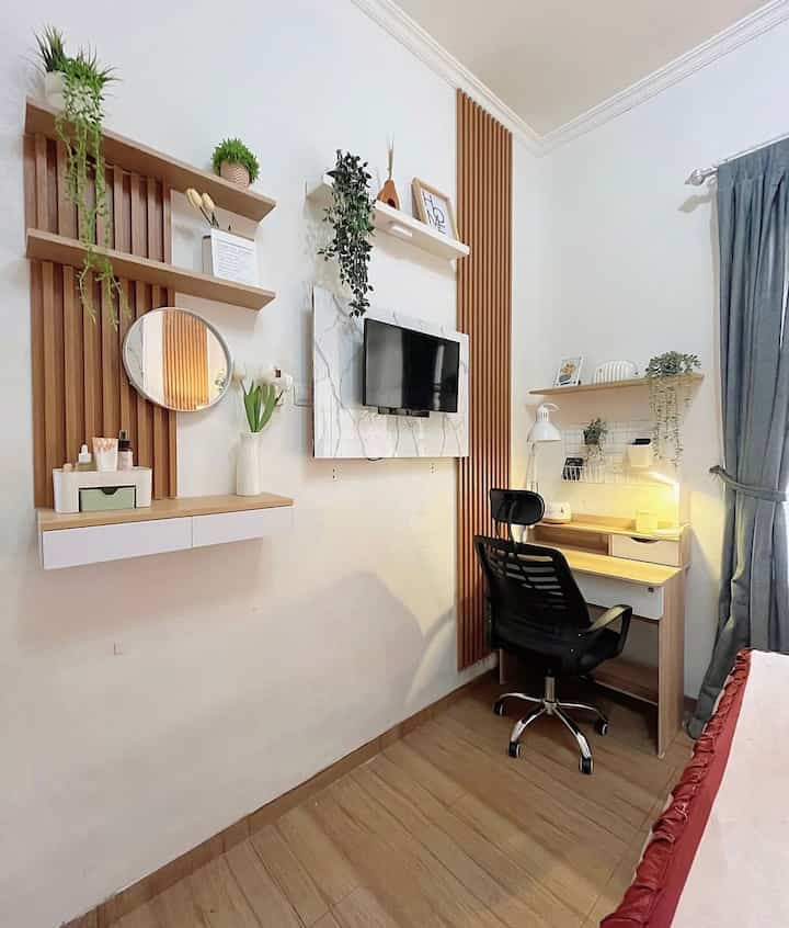
Our house theme is minimalist with a touch of Japandi industrial, so for the selection of material & furniture colors we adjust to the theme.
The color palette is dominated by earth tone colors such as black, brown, white, green and wood.

#MinimalistHousePaint #WarnaCatRumah #CatDalamRumah #CatLuarRumah #CatInterior #CatEksterior #HomeColorPalette #InspirasiWarnaRumah #InspirasiRumahMinimalis #HomeInspo
4
Color Palette 🖤🤎🤍🧡💚 Our house theme is minimalist with a touch of Japandi industrial, so for the selection of material & furniture colors we adjust to the theme. The color palette is dominated by earth tone colors such as black, brown, white, green and wood. #MinimalistHousePaint #WarnaCatRumah #CatDalamRumah #CatLuarRumah #CatInterior #CatEksterior #HomeColorPalette #InspirasiWarnaRumah #InspirasiRumahMinimalis #HomeInspo
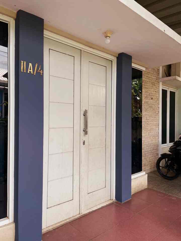
The color palette in this house was deliberately chosen to create a balance between warm and calm. The dark blue on one wall gives a calming impression, while the warm wood accents on the interior wall panels add a welcoming warmth. Neutral colors such as white and cream are the main choices to give the impression of a wider and cleaner space, there is also a pop up of dage green for some small decorative items to maintain a warm impression in the house. In my opinion, this combination is not only pleasing to the eye, but also makes the atmosphere of the house feel more comfortable and inviting—perfect for my little family.

#ExteriorPaint #WarnaCatRumah #HomeColorPalette #InspirasiWarnaRumah
7
The color palette in this house was deliberately chosen to create a balance between warm and calm. The dark blue on one wall gives a calming impression, while the warm wood accents on the interior wall panels add a welcoming warmth. Neutral colors such as white and cream are the main choices to give the impression of a wider and cleaner space, there is also a pop up of dage green for some small decorative items to maintain a warm impression in the house. In my opinion, this combination is not only pleasing to the eye, but also makes the atmosphere of the house feel more comfortable and inviting—perfect for my little family. #ExteriorPaint #WarnaCatRumah #HomeColorPalette #InspirasiWarnaRumah
Hi Ohouse neighbors! For this post I want to share about the Color Palette that I use at @_rumahantik 😍

Actually, if you ask about the color palette in this house, there are a lot of them hehe I really like to combine colors and each room feels different, more like following the mood 😍🤣 but the goal is still to beautify the room and make it look aesthetic, combining any color is beautiful because 😍

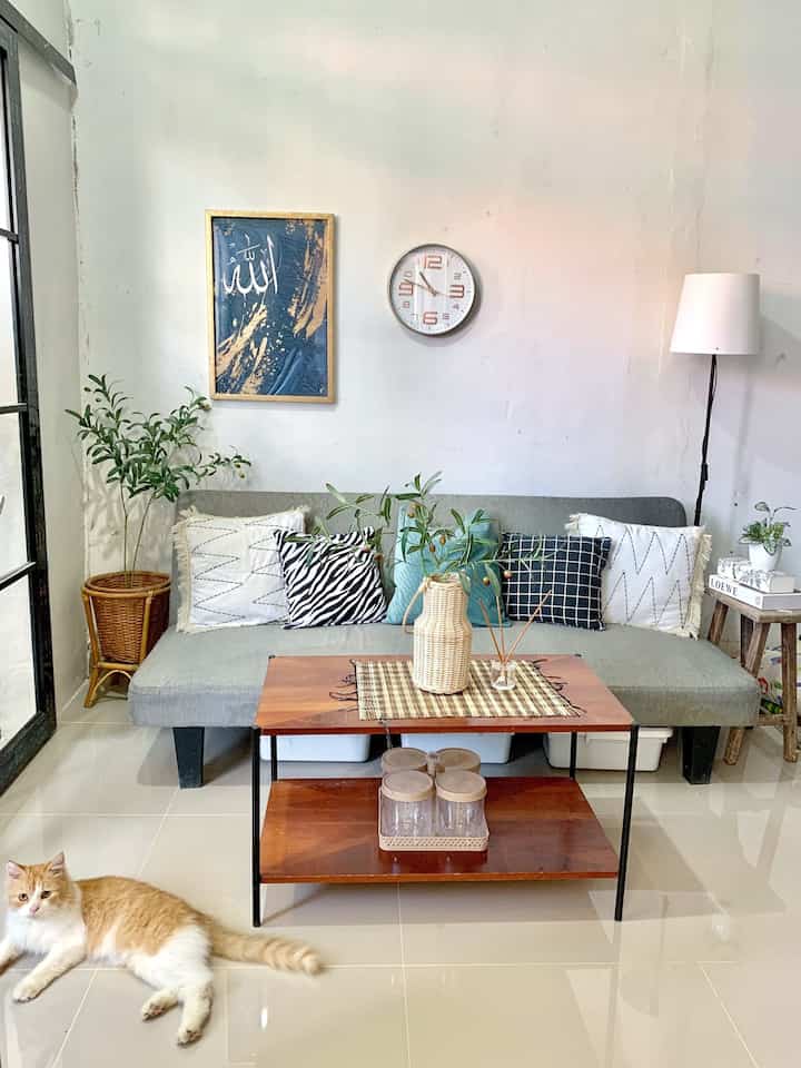
Starting from my living room, actually this gray sofa is already nice with white or cream but I want to give a touch of other colors like on the sofa cushion cover which I gave blue, it adds to the beautiful impression when looking at it, especially if there is wooden furniture and artificial flowers, it looks aesthetic 😍

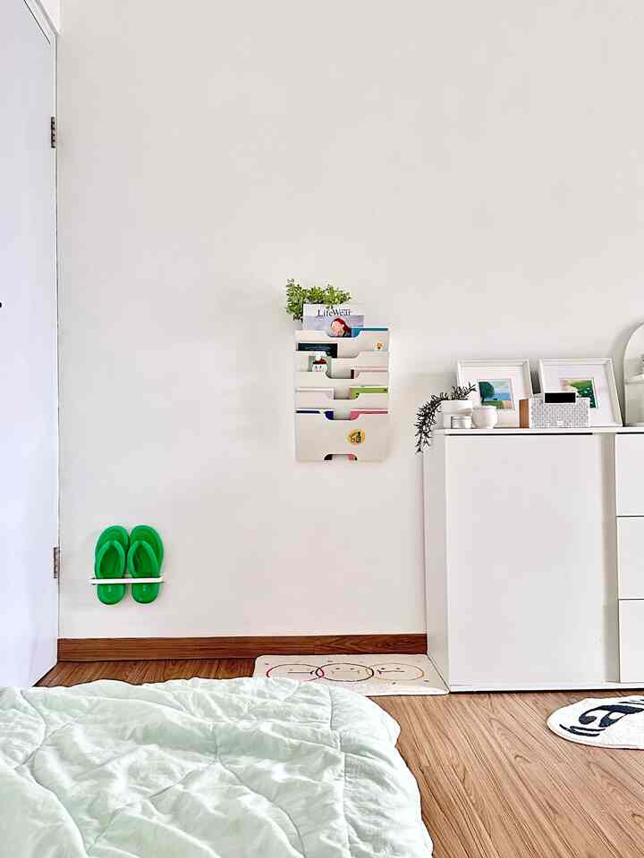
In the bedroom it's also different again, if my room is all wooden, because the vinyl and furniture are made of wood, for the bedroom it's easier to decorate because it's simple, any color fits, and to make it look different on the bedroom door I changed it to bright green so it looks fresher, my mood combining green and light brown really adds, the atmosphere is fresher, the look just adds to the enthusiasm 😍 Well, the kitchen also has a wooden feel, because the furniture is all made of wood, so the impression looks aesthetic, finally I painted my work desk in a slightly dark green combined with white and brown, when you sit here the atmosphere is really comfortable, it's really a real mood booster working here, the enthusiasm really increases 😍 #homecolorpalette #catrumahminimalis #colorpalette #inspirasiwarnarumah 3#minimalist house design} #tonehouse #cattembok #catdindingrumah #catpintukamar #warnacerahdinding #catdindingputih
9
Hi Ohouse neighbors! For this post I want to share about the Color Palette that I use at @_rumahantik 😍 Actually, if you ask about the color palette in this house, there are a lot of them hehe I really like to combine colors and each room feels different, more like following the mood 😍🤣 but the goal is still to beautify the room and make it look aesthetic, combining any color is beautiful because 😍 Starting from my living room, actually this gray sofa is already nice with white or cream but I want to give a touch of other colors like on the sofa cushion cover which I gave blue, it adds to the beautiful impression when looking at it, especially if there is wooden furniture and artificial flowers, it looks aesthetic 😍 In the bedroom it's also different again, if my room is all wooden, because the vinyl and furniture are made of wood, for the bedroom it's easier to decorate because it's simple, any color fits, and to make it look different on the bedroom door I changed it to bright green so it looks fresher, my mood combining green and light brown really adds, the atmosphere is fresher, the look just adds to the enthusiasm 😍 Well, the kitchen also has a wooden feel, because the furniture is all made of wood, so the impression looks aesthetic, finally I painted my work desk in a slightly dark green combined with white and brown, when you sit here the atmosphere is really comfortable, it's really a real mood booster working here, the enthusiasm really increases 😍 #homecolorpalette #catrumahminimalis #colorpalette #inspirasiwarnarumah 3#minimalist house design} #tonehouse #cattembok #catdindingrumah #catpintukamar #warnacerahdinding #catdindingputih
The color palette in my room is very clear, right? 
🤍🤎💚
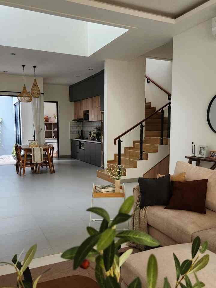
Dominantly white, with wooden accents and pop colors that are mostly green. I've loved green for as long as I can remember and definitely wanted it in my space, but only as an accent. Too much green might feel overwhelming and not so easy on the eyes. That's why I chose white as the dominant base color for a neutral and clean impression (this is very important!) The walls and main furniture such as cabinets, tables and chairs are almost all white. So it's safe for colorful and vibrant items, without making the room look too crowded. 

#homepaintcolors #lantaivinyl
#cabinetcupboards #lampulantai #selimutmusimpanas #coffeetable #mejakerja #kursikerja #HomeColorPalette #InspirasiWarnaRumah
5
The color palette in my room is very clear, right? 🤍🤎💚 Dominantly white, with wooden accents and pop colors that are mostly green. I've loved green for as long as I can remember and definitely wanted it in my space, but only as an accent. Too much green might feel overwhelming and not so easy on the eyes. That's why I chose white as the dominant base color for a neutral and clean impression (this is very important!) The walls and main furniture such as cabinets, tables and chairs are almost all white. So it's safe for colorful and vibrant items, without making the room look too crowded. #homepaintcolors #lantaivinyl #cabinetcupboards #lampulantai #selimutmusimpanas #coffeetable #mejakerja #kursikerja #HomeColorPalette #InspirasiWarnaRumah
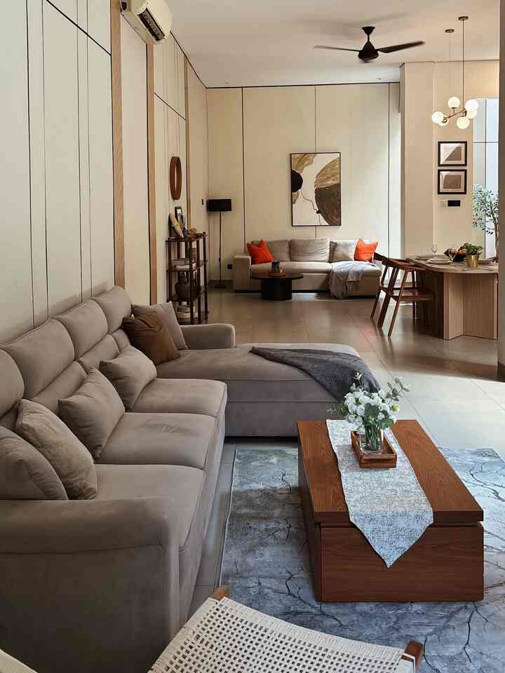
Our house color palette is neutral with white walls, for the interior it has an earth tone theme. Before building the house, we had time to look for inspiration by visiting model houses. From there, we were inspired to use earth tone colors such as gray floors and wood motif floors. In addition, the interior elements are also wood and rattan. But most model houses use wood colors with 1 color theme, for example light or dark wood. Here we chose to use wood with different tones. 

For the 1st floor because it is an open space, the choice of wood color is different for adjacent rooms. The tip is to combine contrasting tones; young-old then align with accompanying tones so that they continue to connect. 
For example: 
Living room; collaboration of old and young wood. 
The kitchen has a hint of gray in harmony with the floor, medium wood tone. 
Next to it is the Home Office using a hint of gray with a slightly darker wood color. 
For the 2nd floor it is safer because there are partitions between rooms, namely bedrooms. 
So they do not affect each other for color. 
Hopefully inspiring 🫶🏻 . 
. 
#HomeColorPalette
#HomeColorInspiration
#ScandinavianHome
#JapandiScandinavian
#OpenSpaceHome
#EarthTone
#MinimalistHousePaint
#HousePaintColor
#InteriorColor
#HPLColorInspiration
7
Our house color palette is neutral with white walls, for the interior it has an earth tone theme. Before building the house, we had time to look for inspiration by visiting model houses. From there, we were inspired to use earth tone colors such as gray floors and wood motif floors. In addition, the interior elements are also wood and rattan. But most model houses use wood colors with 1 color theme, for example light or dark wood. Here we chose to use wood with different tones. For the 1st floor because it is an open space, the choice of wood color is different for adjacent rooms. The tip is to combine contrasting tones; young-old then align with accompanying tones so that they continue to connect. For example: Living room; collaboration of old and young wood. The kitchen has a hint of gray in harmony with the floor, medium wood tone. Next to it is the Home Office using a hint of gray with a slightly darker wood color. For the 2nd floor it is safer because there are partitions between rooms, namely bedrooms. So they do not affect each other for color. Hopefully inspiring 🫶🏻 . . #HomeColorPalette #HomeColorInspiration #ScandinavianHome #JapandiScandinavian #OpenSpaceHome #EarthTone #MinimalistHousePaint #HousePaintColor #InteriorColor #HPLColorInspiration
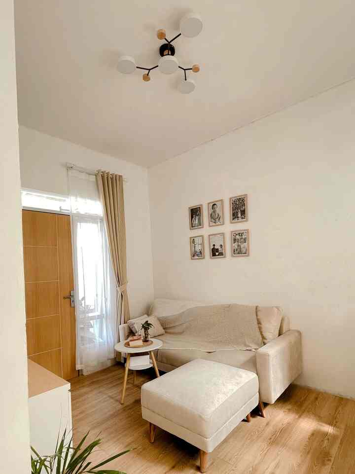
This room has a neutral color palette

- White and cream – The sofa, walls, and curtains are in white or cream, giving a clean and spacious impression.

- Light wood brown – The floor and furniture legs are made of light brown wood, giving a natural and warm touch.

- Black and wood on the lamp – The black color and wood accents on the lamp add a little contrast, but still harmonize with the other wood elements.

- Natural green – a few green plants in the corner provide a fresh green accent, complementing the color nuances of the room.

This color palette was chosen because it emphasizes a minimalist, warm, and natural impression. Neutral colors such as white, cream, and wood brown create a calm and relaxing atmosphere🏡

#HomeColorPallete
#HomeColorInspiration
#MinimalistHomePaint
#LivingRoomPaintColor
#Vinylhouse
#CreamSofa
#CreamLivingRoom
#Wooden nuances
#Wood
5
This room has a neutral color palette - White and cream – The sofa, walls, and curtains are in white or cream, giving a clean and spacious impression. - Light wood brown – The floor and furniture legs are made of light brown wood, giving a natural and warm touch. - Black and wood on the lamp – The black color and wood accents on the lamp add a little contrast, but still harmonize with the other wood elements. - Natural green – a few green plants in the corner provide a fresh green accent, complementing the color nuances of the room. This color palette was chosen because it emphasizes a minimalist, warm, and natural impression. Neutral colors such as white, cream, and wood brown create a calm and relaxing atmosphere🏡 #HomeColorPallete #HomeColorInspiration #MinimalistHomePaint #LivingRoomPaintColor #Vinylhouse #CreamSofa #CreamLivingRoom #Wooden nuances #Wood
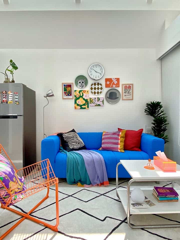
It wasn’t too difficult for us to decide on the color palette in our home. The key is one: be bold and colorful. Our entire home is dominated by bright colors that ‘pop’, because from the beginning we conceptualized the house with a colorful and quirky theme. And this is what our living room looks like with a change in the color of the sofa cover and the addition of an orange wired chair that makes our home even more lively! #CatRuangTamu #Sofa #WallArts #Lampu #HomeColorPalette #InspirasiWarnaRumah
5
It wasn’t too difficult for us to decide on the color palette in our home. The key is one: be bold and colorful. Our entire home is dominated by bright colors that ‘pop’, because from the beginning we conceptualized the house with a colorful and quirky theme. And this is what our living room looks like with a change in the color of the sofa cover and the addition of an orange wired chair that makes our home even more lively! #CatRuangTamu #Sofa #WallArts #Lampu #HomeColorPalette #InspirasiWarnaRumah
Color palette 
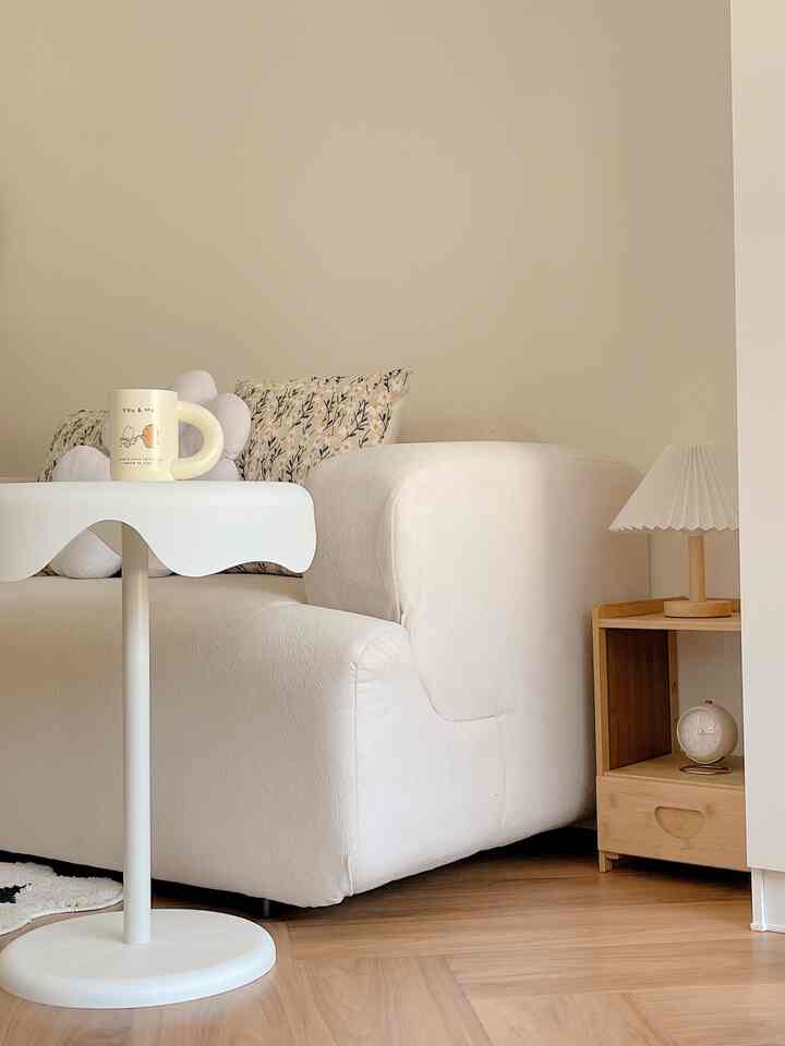
For the room of my house I use a color palette with the same theme of wood & white here I choose white paint color using wood motif vinyl flooring and other home furnishings I also adjust with natural soft colors such as a white coffee table white fireplace shelf bamboo bedside table ivory sofa all look the same color 
I choose wood & white colors to make it look more minimalist natural & bright 
#livingroompaintcolor
#minimalisthomepaint
#homepaintcolor
#homecolorpalette
#homecolorinspiration
#koreanhouse
#aesthetic
#minimalist
4
Color palette For the room of my house I use a color palette with the same theme of wood & white here I choose white paint color using wood motif vinyl flooring and other home furnishings I also adjust with natural soft colors such as a white coffee table white fireplace shelf bamboo bedside table ivory sofa all look the same color I choose wood & white colors to make it look more minimalist natural & bright #livingroompaintcolor #minimalisthomepaint #homepaintcolor #homecolorpalette #homecolorinspiration #koreanhouse #aesthetic #minimalist
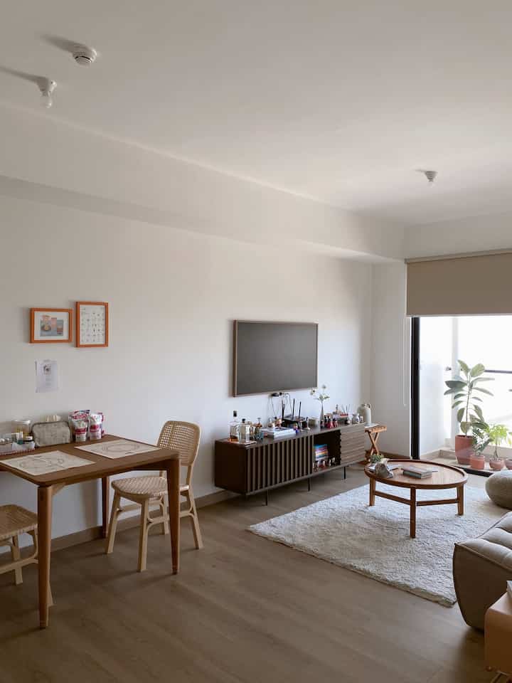
Tone casa de kath is natural colors such as white, brown, ash and the dominance of the play of young and old wood colors, the warm and elegant effect of wood color combined with solid color
#HomeColorPalette
#HomeColorInspiration
#HomeColor
#Living room
#Home Design
#Dining Room
4
Tone casa de kath is natural colors such as white, brown, ash and the dominance of the play of young and old wood colors, the warm and elegant effect of wood color combined with solid color #HomeColorPalette #HomeColorInspiration #HomeColor #Living room #Home Design #Dining Room
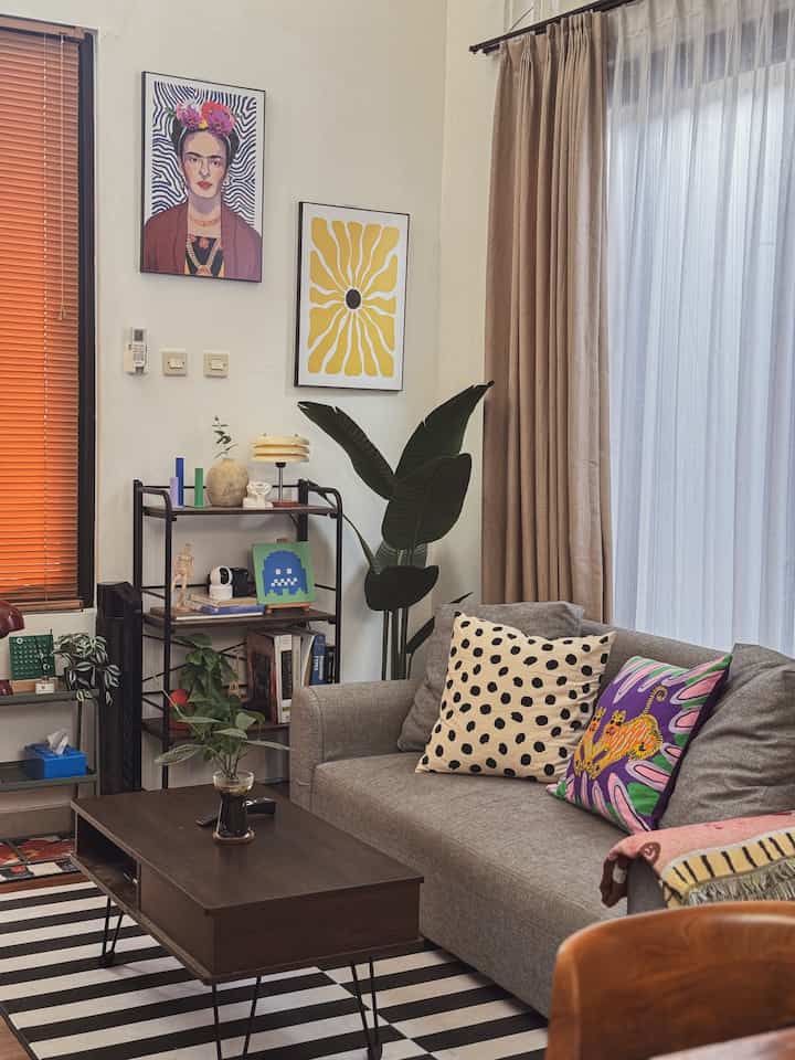
The color palette of the living room area is dark walnut brown and cream. But in between I like the use of bright colors to complement it. I think this color is suitable for making the atmosphere happy! To combine these different colors, there are actually no special limitations, just a little tip from me, we can use large furniture (tables, chairs, sofas, cabinets) with the same color. Then add-on additional colors as a sweetener! 💗

#FamilyRoomFloor #LantaiVinyl #HomeColorPallete #InspirasiWarnaRumah
4
The color palette of the living room area is dark walnut brown and cream. But in between I like the use of bright colors to complement it. I think this color is suitable for making the atmosphere happy! To combine these different colors, there are actually no special limitations, just a little tip from me, we can use large furniture (tables, chairs, sofas, cabinets) with the same color. Then add-on additional colors as a sweetener! 💗 #FamilyRoomFloor #LantaiVinyl #HomeColorPallete #InspirasiWarnaRumah
Sharing the color palette of my apartment! 👋🏻

Since I love Japandi and Mid-Century Modern styles, I went for earthy tones like cream, brown, and off-white. With a lot of wooden furniture, the palette feels natural and warm. For a touch of Mid-Century Modern, I added pops of mustard yellow, terracotta, olive green, and more.

Here are 3 tips for mixing Japandi and Mid-Century Modern styles when creating a color palette:

👉🏻 Start with Neutrals: Use soft shades like cream, beige, or off-white as your base to create a calming foundation.

👉🏻 Incorporate Wood Tones: Add warm wooden elements to bring in the natural feel of Japandi, while keeping it versatile with Mid-Century furniture.

👉🏻 Add Accent Colors: For a Mid-Century twist, use accents like mustard yellow, terracotta, or olive green to create a vibrant but balanced space.

#CatRumahMinimalis #WarnaCatRumah #WarnaCatRuangTamu #HomeColorPalette #InspirasiWarnaRumah #RumahJapandi #RumahMidCenturyModern
9
Sharing the color palette of my apartment! 👋🏻 Since I love Japandi and Mid-Century Modern styles, I went for earthy tones like cream, brown, and off-white. With a lot of wooden furniture, the palette feels natural and warm. For a touch of Mid-Century Modern, I added pops of mustard yellow, terracotta, olive green, and more. Here are 3 tips for mixing Japandi and Mid-Century Modern styles when creating a color palette: 👉🏻 Start with Neutrals: Use soft shades like cream, beige, or off-white as your base to create a calming foundation. 👉🏻 Incorporate Wood Tones: Add warm wooden elements to bring in the natural feel of Japandi, while keeping it versatile with Mid-Century furniture. 👉🏻 Add Accent Colors: For a Mid-Century twist, use accents like mustard yellow, terracotta, or olive green to create a vibrant but balanced space. #CatRumahMinimalis #WarnaCatRumah #WarnaCatRuangTamu #HomeColorPalette #InspirasiWarnaRumah #RumahJapandi #RumahMidCenturyModern
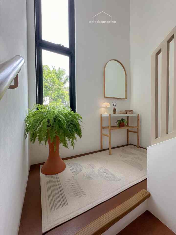
The color palette in this house is still loyal to earthtone, white, light brown, terracotta and a little black on all door and window frames. We deliberately chose earthtone because our house theme is a mix of nordic scandinavian/japanese/korean home where earthtone is very dominant. With this color palette, we feel the color is calming, and makes the rooms in the house feel warmer. 🤍🤎🖤

#homecolorpalette
#homecolorinspiration
#earthtone
#wpc
#conwood
4
The color palette in this house is still loyal to earthtone, white, light brown, terracotta and a little black on all door and window frames. We deliberately chose earthtone because our house theme is a mix of nordic scandinavian/japanese/korean home where earthtone is very dominant. With this color palette, we feel the color is calming, and makes the rooms in the house feel warmer. 🤍🤎🖤 #homecolorpalette #homecolorinspiration #earthtone #wpc #conwood
The color palette in the bedroom area is indeed very different from the color palette of the entire area in this house

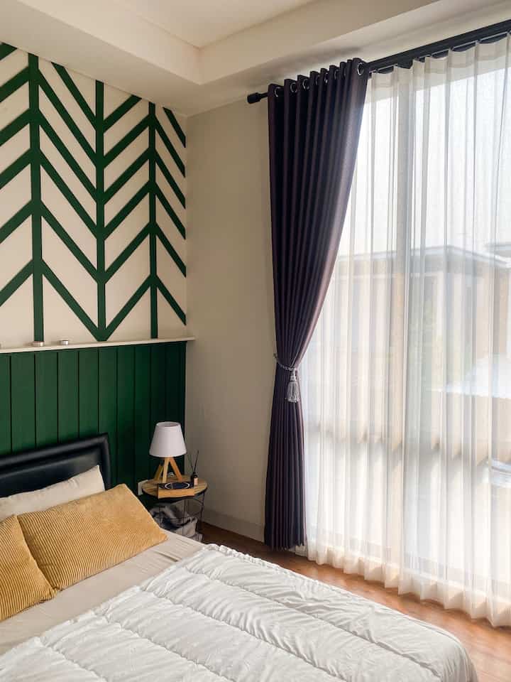
The bedroom area on the main wall we provide a zigzag patterned wallbatten with a green color, and the other 3 walls remain with a gentle white color.

The color elements in the room are dominated by fairly neutral colors, including textured wood patterned vinyl flooring, a choice of room decorations that also have brown or white colors, and a choice of matching bed sheet colors can make a room with an epic color combination feel very attractive but feel warm

Combining colors when determining a theme is also an important factor

#catkamar
#warnakombinasi
#warnacatkamar
#homecolorpalette
#inspirationwarnarumah
#inspirationwarnakamar
#segehouse
4
The color palette in the bedroom area is indeed very different from the color palette of the entire area in this house The bedroom area on the main wall we provide a zigzag patterned wallbatten with a green color, and the other 3 walls remain with a gentle white color. The color elements in the room are dominated by fairly neutral colors, including textured wood patterned vinyl flooring, a choice of room decorations that also have brown or white colors, and a choice of matching bed sheet colors can make a room with an epic color combination feel very attractive but feel warm Combining colors when determining a theme is also an important factor #catkamar #warnakombinasi #warnacatkamar #homecolorpalette #inspirationwarnarumah #inspirationwarnakamar #segehouse