
HomeShop

#pilihwarnarumah

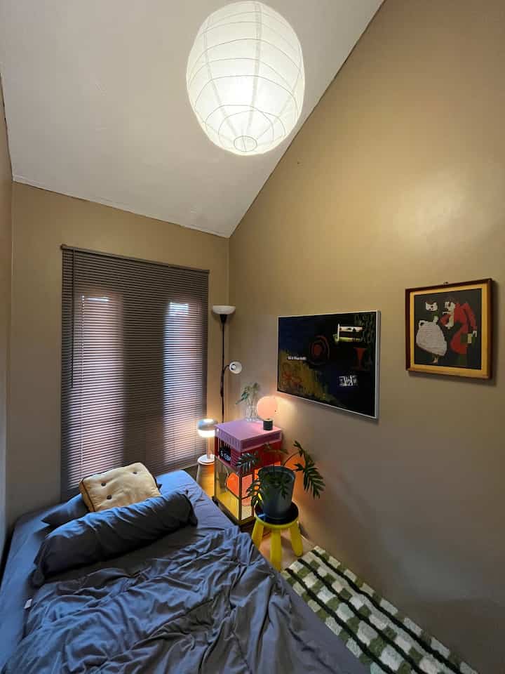
Overall, the Color Palatte in the rooftop room consists of warm neutral colors with several bright color accents that provide contrast and uniqueness. Minimalism doesn't have to use white. Brown can provide a warm and comfortable feel which is also in accordance with a minimalist style. ๐Ÿ‘Œ

Next, lights or lighting are very important. Lighting can affect how wall colors, furniture, and other decorations look, as well as how someone feels when they are in the room. With this combination of brown walls and color-adjustable lighting, the room looks more characterful and unique โœจ๐Ÿ™Œ๐Ÿป

#ChooseHomeColor
#HomeColorPalette
#HomeColor Recommendations
#Minimalist
#RoomColor Recommendations
#RoomColor
4
Overall, the Color Palatte in the rooftop room consists of warm neutral colors with several bright color accents that provide contrast and uniqueness. Minimalism doesn't have to use white. Brown can provide a warm and comfortable feel which is also in accordance with a minimalist style. ๐Ÿ‘Œ Next, lights or lighting are very important. Lighting can affect how wall colors, furniture, and other decorations look, as well as how someone feels when they are in the room. With this combination of brown walls and color-adjustable lighting, the room looks more characterful and unique โœจ๐Ÿ™Œ๐Ÿป #ChooseHomeColor #HomeColorPalette #HomeColor Recommendations #Minimalist #RoomColor Recommendations #RoomColor
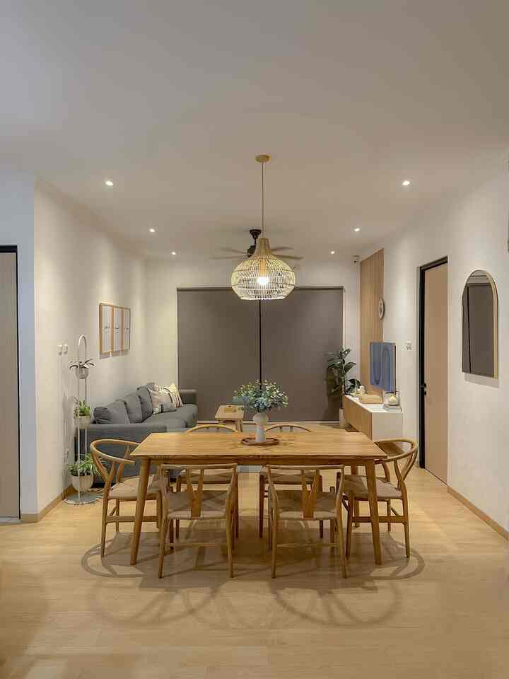
The color palette in this house is earth tones. White colors, natural wood colors are very dominant in almost all rooms. For new decorations, play a little with bright colors, but only on small decorations, such as pillowcases, cooking utensils, wall art. 

The choice of this color palette was more because the initial goal was to want the house to have a Nordic Scandinavian feel which was more towards white and wood colors so as to create a warm, cozy feel. 

Slide 1 
Dining room overlooking the living room

Slide 2 
Sitting room

Slide 3
Landing/stair landing

Slide 4
Living room overlooking the kitchen

#choosehomecolor
#homecolorpalette
#home color recommendations
4
The color palette in this house is earth tones. White colors, natural wood colors are very dominant in almost all rooms. For new decorations, play a little with bright colors, but only on small decorations, such as pillowcases, cooking utensils, wall art. The choice of this color palette was more because the initial goal was to want the house to have a Nordic Scandinavian feel which was more towards white and wood colors so as to create a warm, cozy feel. Slide 1 Dining room overlooking the living room Slide 2 Sitting room Slide 3 Landing/stair landing Slide 4 Living room overlooking the kitchen #choosehomecolor #homecolorpalette #home color recommendations
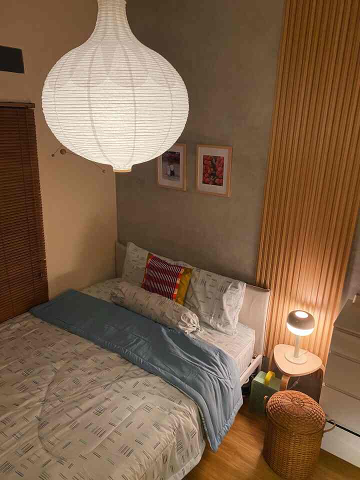
This time the story is about a bedroom color palette that has a Japandi style nuance 

The color palette you want to highlight is a combination of natural wood (light brown) and white, so it creates a fresh impression in the morning/afternoon and warm at night ๐Ÿƒ

To maximize the warm impression at night, this room uses dim lighting from hanging lanterns, creating warm light ๐Ÿฎ

The theme and color palette in this room are indeed different from other rooms which have a more mid-century modern concept, because for us the room is the warmest place in the house, so the concept chosen is Japandi โœจ

#ChooseHomeColor #HomeColorPalette
#HouseColor Recommendations #bedroomstyling #dekorasikamartidur #japandi #rumahdeveloper #depok
5
This time the story is about a bedroom color palette that has a Japandi style nuance The color palette you want to highlight is a combination of natural wood (light brown) and white, so it creates a fresh impression in the morning/afternoon and warm at night ๐Ÿƒ To maximize the warm impression at night, this room uses dim lighting from hanging lanterns, creating warm light ๐Ÿฎ The theme and color palette in this room are indeed different from other rooms which have a more mid-century modern concept, because for us the room is the warmest place in the house, so the concept chosen is Japandi โœจ #ChooseHomeColor #HomeColorPalette #HouseColor Recommendations #bedroomstyling #dekorasikamartidur #japandi #rumahdeveloper #depok
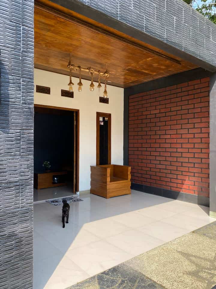
โšช๏ธ๐ŸŸคโšซ๏ธ Color palette in the terrace area

The choice of color palette in the terrace area is quite simple, dominating black, but also mixed with white, inviting white furniture and teak wood plavons, giving a classic modern impression so that it doesn't seem monotonous. We also added a brick backdrop on one wall. 

#ChooseHomeColor
#HomeColorPalette
#HomeColor Recommendations
#TerraceInspiration
#House Terrace
#Bogor
#bananahome
4
โšช๏ธ๐ŸŸคโšซ๏ธ Color palette in the terrace area The choice of color palette in the terrace area is quite simple, dominating black, but also mixed with white, inviting white furniture and teak wood plavons, giving a classic modern impression so that it doesn't seem monotonous. We also added a brick backdrop on one wall. #ChooseHomeColor #HomeColorPalette #HomeColor Recommendations #TerraceInspiration #House Terrace #Bogor #bananahome
โž– House Color Palette 

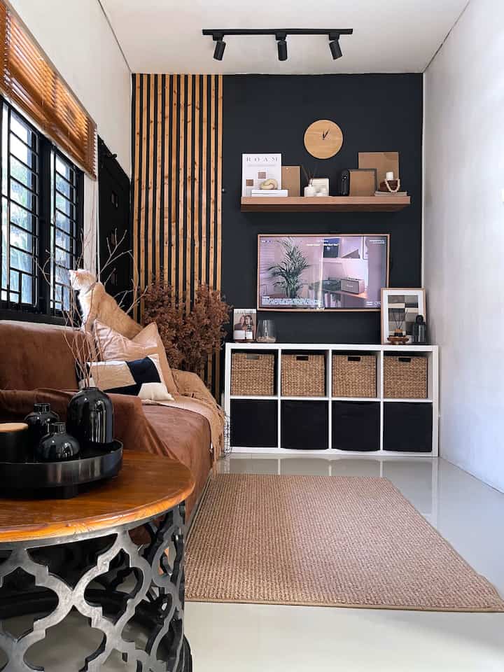
As you can see, the color palette aka color tone in this #lollahouse house has #warmandbold nuances.

The combination of black, white, brown, and beige colors makes our home even more special and #aesthetic. Although not extensive, we love this color palette that leads to #modernrusticstyle decor.

The dominance of brown and wood colors add a warm & cozy effect to this home, and the black color gives a special accent.

Hope it inspires ๐Ÿ–ค๐ŸคŽ

#PilihWarnaRumah #HomeColorPalette #RekomendasiWarnaRumah #homedecor #livingroom #livingroomstyle #ruangtv #ruangtamu #dekorasiruangtamu #dekorasiruangkeluarga #homestyle
5
โž– House Color Palette As you can see, the color palette aka color tone in this #lollahouse house has #warmandbold nuances. The combination of black, white, brown, and beige colors makes our home even more special and #aesthetic. Although not extensive, we love this color palette that leads to #modernrusticstyle decor. The dominance of brown and wood colors add a warm & cozy effect to this home, and the black color gives a special accent. Hope it inspires ๐Ÿ–ค๐ŸคŽ #PilihWarnaRumah #HomeColorPalette #RekomendasiWarnaRumah #homedecor #livingroom #livingroomstyle #ruangtv #ruangtamu #dekorasiruangtamu #dekorasiruangkeluarga #homestyle
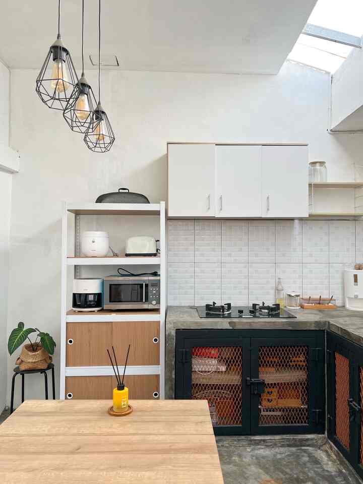
Neutral Color Palatte was chosen for this house. So that it doesn't seem too crowded and the room feels more spacious

#ChooseHomeColor #HomeColorPalatte #RekomendasiWarnaRumah #PaletWarnaRumah #InspirasiWarnaRumah
4
Neutral Color Palatte was chosen for this house. So that it doesn't seem too crowded and the room feels more spacious #ChooseHomeColor #HomeColorPalatte #RekomendasiWarnaRumah #PaletWarnaRumah #InspirasiWarnaRumah
Bathroom & Bedroom Color Palette ๐Ÿค๐ŸคŽ๐Ÿ’š

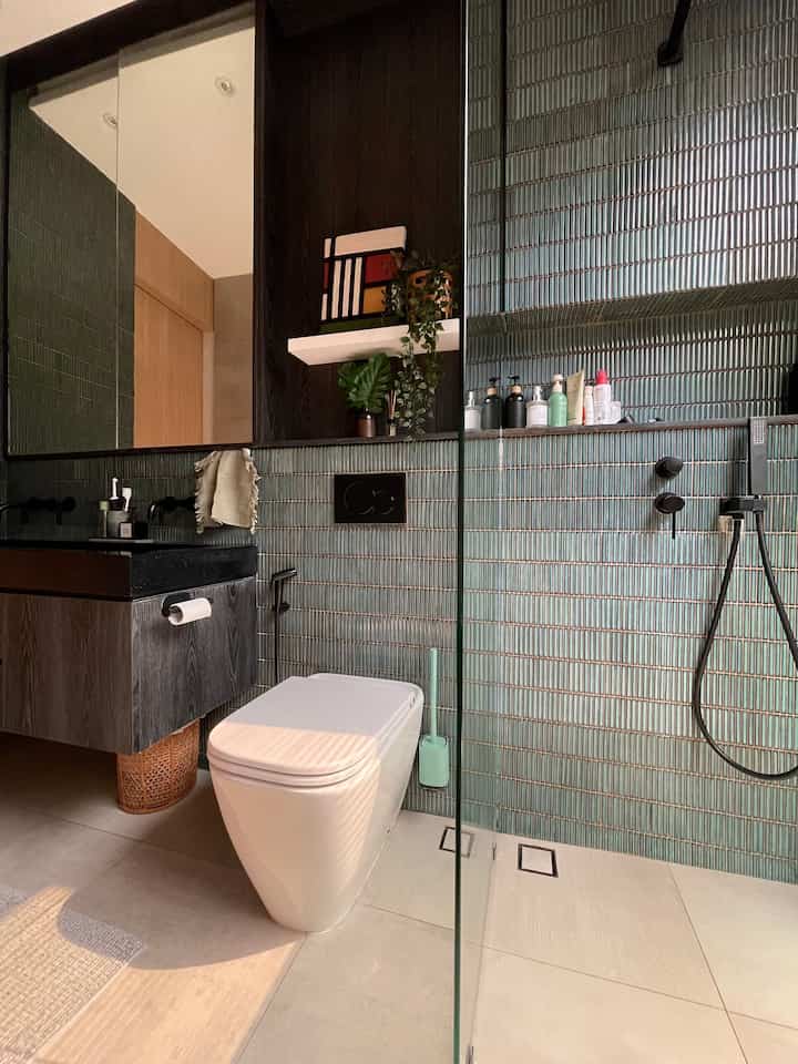
The main color palette in corner houses tends to be neutral earth colors, dominated by light brown, gray and white. We chose neutral colors to make them more minimalist and easy to combine with other colors when bored and also so that they are not monotonous, for example adding color to linens such as pillowcases, towels, throw blankets and bed sheets as decoration.

But for the main bathroom at home, the color palette is a little more tropical with the use of black and dark green. And the bedroom is still dominated by earth neutral colors, and currently uses shades of green as well as green decorations and bed sheet sets๐Ÿ’š
_
#ChooseHomeColor
#HomeColorPalette
#HomeColor Recommendations
#athomecorner
5
Bathroom & Bedroom Color Palette ๐Ÿค๐ŸคŽ๐Ÿ’š The main color palette in corner houses tends to be neutral earth colors, dominated by light brown, gray and white. We chose neutral colors to make them more minimalist and easy to combine with other colors when bored and also so that they are not monotonous, for example adding color to linens such as pillowcases, towels, throw blankets and bed sheets as decoration. But for the main bathroom at home, the color palette is a little more tropical with the use of black and dark green. And the bedroom is still dominated by earth neutral colors, and currently uses shades of green as well as green decorations and bed sheet sets๐Ÿ’š _ #ChooseHomeColor #HomeColorPalette #HomeColor Recommendations #athomecorner
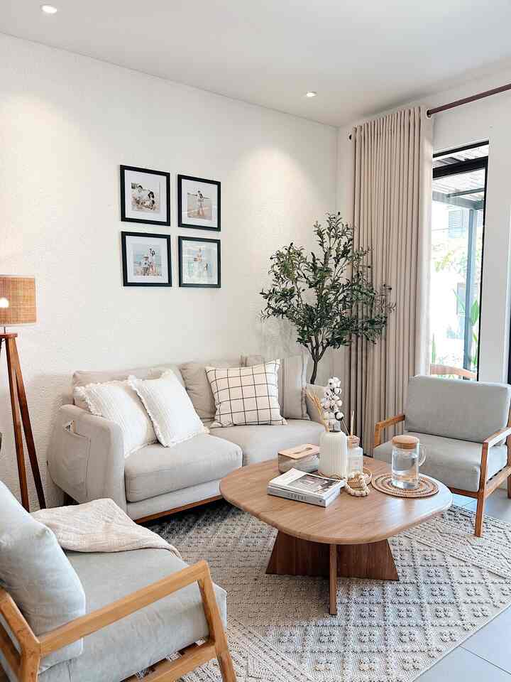
The color palette at home is natural colors โ˜บ๏ธ

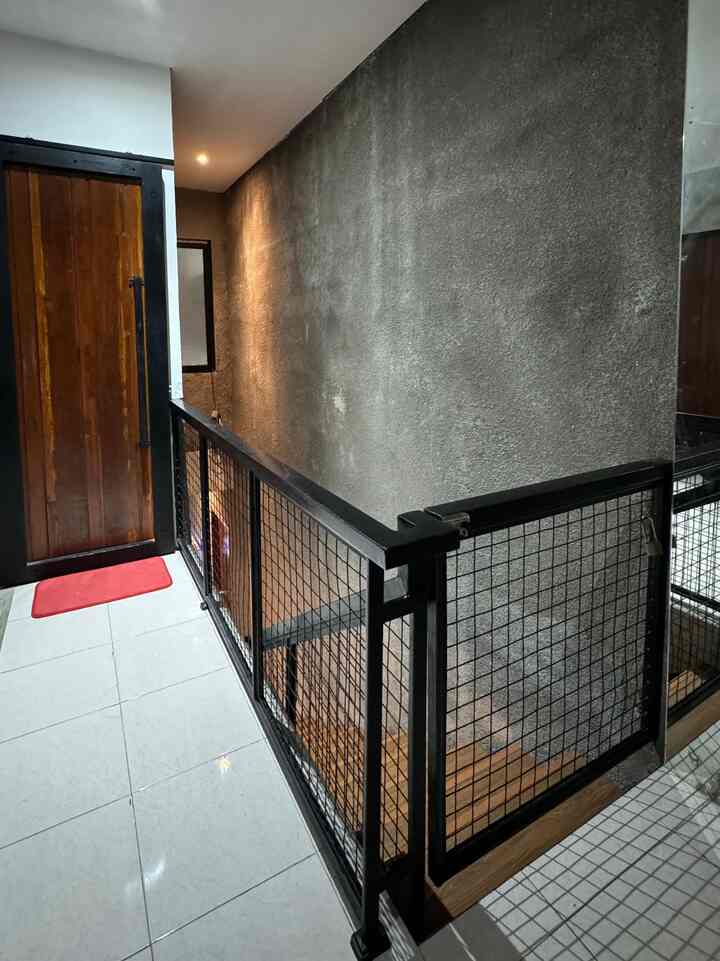
Industrial buildings, whether houses, cafes, restaurants or others, tend to have minimalist designs. Use a neutral, monochrome and simple color palette 

using wood accents that provide visual interest. 

#ChooseHomeColor
#HomeColorPalette
#HomeColor Recommendations
#Rumahyuqibam
#IndustrialHouse
6
The color palette at home is natural colors โ˜บ๏ธ Industrial buildings, whether houses, cafes, restaurants or others, tend to have minimalist designs. Use a neutral, monochrome and simple color palette using wood accents that provide visual interest. #ChooseHomeColor #HomeColorPalette #HomeColor Recommendations #Rumahyuqibam #IndustrialHouse
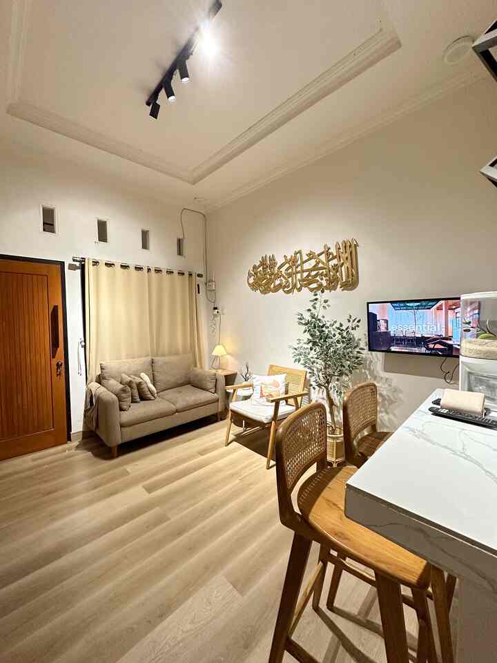
Color is the determining factor, in my house, soft gray and teak are dominant for all the furniture. 

#ChooseHomeColor
#HomeColorPalette
#HomeColor Recommendations #desainruangtamu #interior #kbp #rumahrstetik
4
Color is the determining factor, in my house, soft gray and teak are dominant for all the furniture. #ChooseHomeColor #HomeColorPalette #HomeColor Recommendations #desainruangtamu #interior #kbp #rumahrstetik
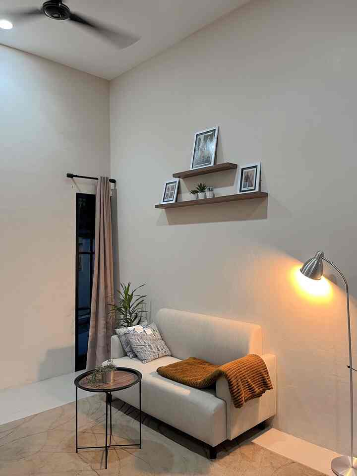
The color palette that I created in my house is white wood and neutral colors because my house has a Japandi Style concept
The color of wooden furniture combined with bright house paint colors / with a little beige tone will make the atmosphere of the house warm โค๏ธ

Hopefully it will inspire ๐Ÿ˜
#ChooseHomeColor
#HomeColorPalette
#HomeColor Recommendations
#Subsidized House #Rumahmungil #Tangerang #Tinyhouse #DekorasiUnik
5
The color palette that I created in my house is white wood and neutral colors because my house has a Japandi Style concept The color of wooden furniture combined with bright house paint colors / with a little beige tone will make the atmosphere of the house warm โค๏ธ Hopefully it will inspire ๐Ÿ˜ #ChooseHomeColor #HomeColorPalette #HomeColor Recommendations #Subsidized House #Rumahmungil #Tangerang #Tinyhouse #DekorasiUnik
Color Palette๐ŸŽจโœจ
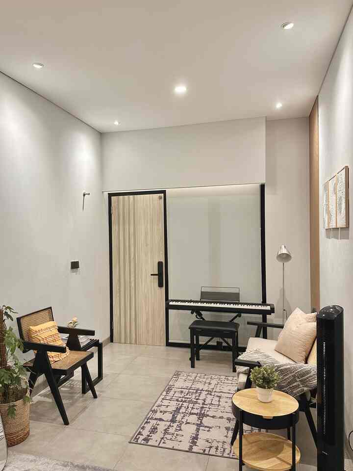
The color palette in our open space room is earth tone colors, dominated by neutral colors, beige, wood grain, mixed and matched with black and gray with a little touch of green from plants. 
Actually, I wanted to mix and match colorful colors, but I wasn't that brave because we adapted the theme of our house from the start, wanting the theme to be semi-industrial minimalist.
#ChooseHomeColor
#HomeColorPalette
#HomeColor Recommendations
#MinimalistHome
4
Color Palette๐ŸŽจโœจ The color palette in our open space room is earth tone colors, dominated by neutral colors, beige, wood grain, mixed and matched with black and gray with a little touch of green from plants. Actually, I wanted to mix and match colorful colors, but I wasn't that brave because we adapted the theme of our house from the start, wanting the theme to be semi-industrial minimalist. #ChooseHomeColor #HomeColorPalette #HomeColor Recommendations #MinimalistHome
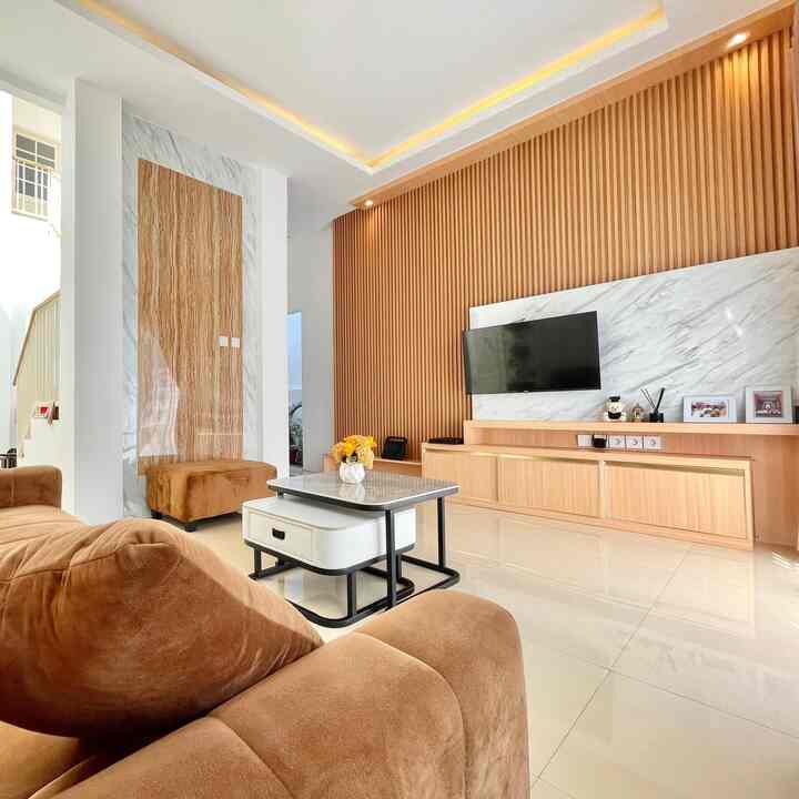
Mahendra's color palette at home โœจ
The color selection in this house uses natural colors ranging from gray, a combination of wood, and black.

I chose these colors because they suit the theme of the house, namely modern industrial. So that the industrial style doesn't stand out too much, it is combined with modern colors from gray and wood.

#ChooseHomeColor
#HomeColorPalette
#HomeColor Recommendations
#ModernIndustrial
#Homestyling
#Homedecor
#homestagram
5
Mahendra's color palette at home โœจ The color selection in this house uses natural colors ranging from gray, a combination of wood, and black. I chose these colors because they suit the theme of the house, namely modern industrial. So that the industrial style doesn't stand out too much, it is combined with modern colors from gray and wood. #ChooseHomeColor #HomeColorPalette #HomeColor Recommendations #ModernIndustrial #Homestyling #Homedecor #homestagram
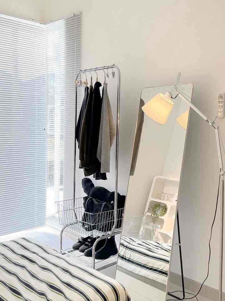
The color palette in the Akame house is full of white and brown wood in accordance with our interior theme, namely Japanese. The combination of these two colors will make the house look spacious, clean and warm... 
We also chose some of our furniture, such as the sofa, in brown so that it blends with the interior of the living room. 
#ChooseHomeColor #HomeColorPalette #RekomendasiWarnaRumah #interiorJapandi
4
The color palette in the Akame house is full of white and brown wood in accordance with our interior theme, namely Japanese. The combination of these two colors will make the house look spacious, clean and warm... We also chose some of our furniture, such as the sofa, in brown so that it blends with the interior of the living room. #ChooseHomeColor #HomeColorPalette #RekomendasiWarnaRumah #interiorJapandi
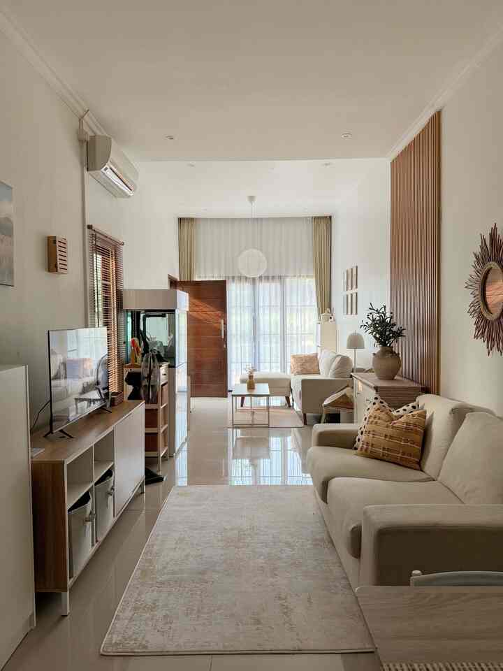
How I style My Room with โšซ๏ธโšช๏ธ๐ŸŸข as my Color Palette :

1. I chose my favorite color white as the dominant color in my room, besides this color also gives a bright and spacious impression.

2. Choose black as a contrasting color to give an elegant and simple impression.

3. Green as a complementary color and beautifies the room for a more beautiful and cool impression.

#ChooseHomeColor
#HomeColorPalette
#HomeColor Recommendations
#BedroomStyling
5
How I style My Room with โšซ๏ธโšช๏ธ๐ŸŸข as my Color Palette : 1. I chose my favorite color white as the dominant color in my room, besides this color also gives a bright and spacious impression. 2. Choose black as a contrasting color to give an elegant and simple impression. 3. Green as a complementary color and beautifies the room for a more beautiful and cool impression. #ChooseHomeColor #HomeColorPalette #HomeColor Recommendations #BedroomStyling
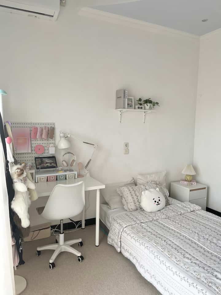
My home color palette______

The basic colors in this house are white, beidge and brown which are reflected on the walls, floor and curtains. Then for the decorative knick-knacks, we give a touch of different colors but still stick to natural colors such as yellow, terracotta, gray and black.

The reason for choosing this color palette is because my husband and I like natural colors. Especially for home. Seeing a house with lots of natural elements in it is really beautiful for us. And also natural colors are easy to mix and match.

So for those who are just starting to fill and decorate their house, and are confused about where to start, start first with what we like, because a house is a reflection of the characteristics of its owner.

#ChooseHomeColor #HomeColorPalette #RekomendasiWarnaRumah
6
My home color palette______ The basic colors in this house are white, beidge and brown which are reflected on the walls, floor and curtains. Then for the decorative knick-knacks, we give a touch of different colors but still stick to natural colors such as yellow, terracotta, gray and black. The reason for choosing this color palette is because my husband and I like natural colors. Especially for home. Seeing a house with lots of natural elements in it is really beautiful for us. And also natural colors are easy to mix and match. So for those who are just starting to fill and decorate their house, and are confused about where to start, start first with what we like, because a house is a reflection of the characteristics of its owner. #ChooseHomeColor #HomeColorPalette #RekomendasiWarnaRumah
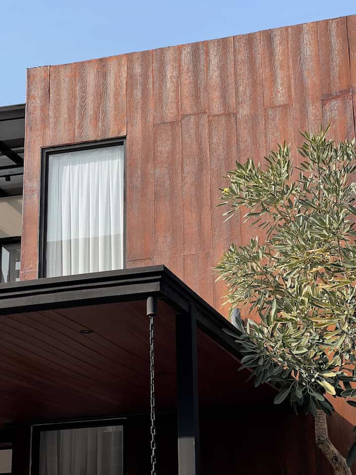
The color palette of my room is dominated by white, from the paint color to the furniture chosen, the neutral white color makes it easy to combine with any color + looks cleaner. 

I also added pastel colors from decoration items + green from plants to keep the room looking fresh 

#ChooseHomeColor
#HomeColorPallete
#HomeColor Recommendations
4
The color palette of my room is dominated by white, from the paint color to the furniture chosen, the neutral white color makes it easy to combine with any color + looks cleaner. I also added pastel colors from decoration items + green from plants to keep the room looking fresh #ChooseHomeColor #HomeColorPallete #HomeColor Recommendations
Color Palette โœจ

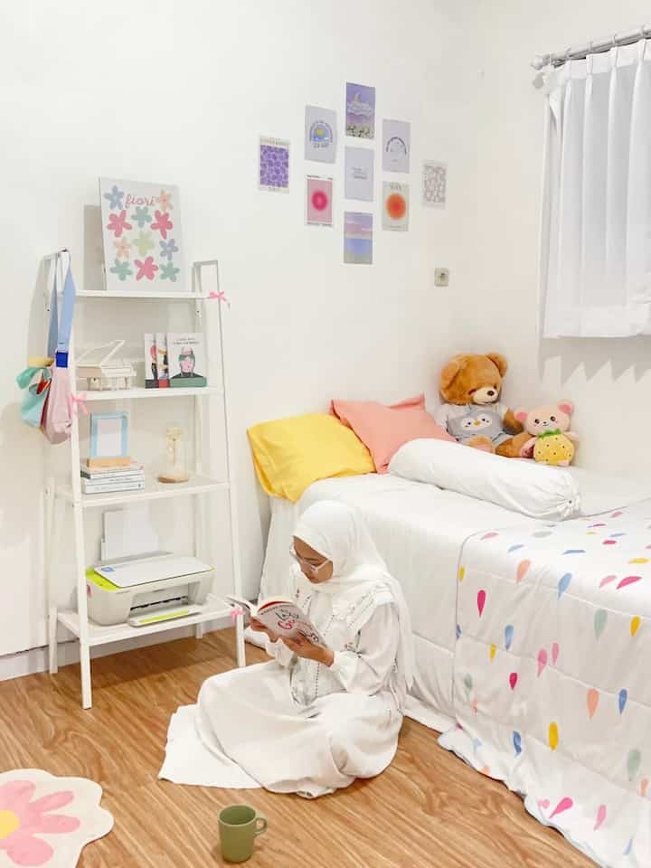
The color palette in #BruwnHouse is earth tones, dominated by brown and black to suit the industrial theme of the house. Actually, I want to bring other colors like yellow or orange into the house to make it look colorful, but again I'm not that brave because it's already in the brown and black zone ๐Ÿ˜†

#ChooseHomeColor
#HomeColorPalette
#HomeColor Recommendations
#IndustrialHouse
#IndustrialHouse
#ColorPalette
#Palette
4
Color Palette โœจ The color palette in #BruwnHouse is earth tones, dominated by brown and black to suit the industrial theme of the house. Actually, I want to bring other colors like yellow or orange into the house to make it look colorful, but again I'm not that brave because it's already in the brown and black zone ๐Ÿ˜† #ChooseHomeColor #HomeColorPalette #HomeColor Recommendations #IndustrialHouse #IndustrialHouse #ColorPalette #Palette
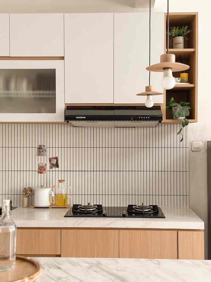
The color palette at Rumahanind is predominantly white with touches of colorful nuances.

For the floor itself, I chose wood shades so that the neutral impression and warm atmosphere of the house could still be felt.

For the room I use predominantly white because it can make the room more spacious and clean, for colorful nuances because I think it suits my personality. Apart from that, aesthetically these colors make my room more lively ^~^

Hopefully it can inspire your friends! ๐Ÿ˜‰

#ChooseHomeColor #HomeColorPalette #RekomendasiWarnaRumah #DekorasiKamar #KamarAesthetic
4
The color palette at Rumahanind is predominantly white with touches of colorful nuances. For the floor itself, I chose wood shades so that the neutral impression and warm atmosphere of the house could still be felt. For the room I use predominantly white because it can make the room more spacious and clean, for colorful nuances because I think it suits my personality. Apart from that, aesthetically these colors make my room more lively ^~^ Hopefully it can inspire your friends! ๐Ÿ˜‰ #ChooseHomeColor #HomeColorPalette #RekomendasiWarnaRumah #DekorasiKamar #KamarAesthetic
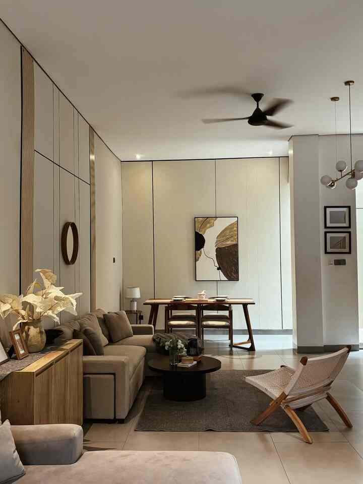
The color palette at Keinahouse is dominant in white and wood, because we really like the Japanesedi house concept, which is synonymous with touches of wood or bamboo, we also give it a touch of black and green so it's not too monotonous. 

#ChooseHomeColor
#HomeCollorPalette
#HomeColor Recommendations
#LivingRoom
#Kitchens
#RumabDecoration
#room decoration
4
The color palette at Keinahouse is dominant in white and wood, because we really like the Japanesedi house concept, which is synonymous with touches of wood or bamboo, we also give it a touch of black and green so it's not too monotonous. #ChooseHomeColor #HomeCollorPalette #HomeColor Recommendations #LivingRoom #Kitchens #RumabDecoration #room decoration
The tone/color palette at Casa de Kath is dominated by neutral colors such as light brown, light green and wood, to get a warm, minimalist and cozy impression, while black is "inserted" a little to beautify the room, for example the coffee table was chosen HPL is black with natural wood streaks
 #PilihWarnaRumah
#HomeColorPalette
#HomeColor Recommendations
#depok
#modernhome
#roomstyling
4
The tone/color palette at Casa de Kath is dominated by neutral colors such as light brown, light green and wood, to get a warm, minimalist and cozy impression, while black is "inserted" a little to beautify the room, for example the coffee table was chosen HPL is black with natural wood streaks #PilihWarnaRumah #HomeColorPalette #HomeColor Recommendations #depok #modernhome #roomstyling