
라미_홈's post
1 / 4
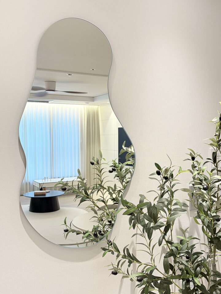
A small tip for making your home look tidy: ‘Matching Tones’ 🤍 While choosing pretty furniture and accessories one by one is important, I start by determining the overall color tone of my home first. For my home, I used white and cream as the base and added beige and wood to create a warm atmosphere. I added natural vitality with the green of olive trees and used black and metallic materials as accents to give the space depth and just the right amount of contrast. 🌿 It is important not to match everything in the same color, but to repeat colors with similar hue and temperature, and to use accent colors appropriately. Even if the individual furniture and accessories are different, if the overall tone is connected, the space looks much more harmonious and sophisticated. Ultimately, in interior design, balance that makes things harmonize is more important than adding a lot of pretty things! Lately, I have been completing my home by adhering to this small principle. 🤍 #CornSoupRecords #인테리어노하우 #거실 #주방인테리어 #화이트인테리어 #필름시공 #인테리어조화 #셀프시공
- 08.28
- Likes
- 33
- Saved
- 26
- Views
- 39
Comments0
