
베이지얌's post
1 / 3
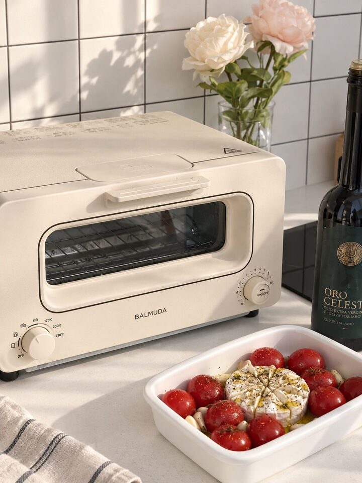
#SmartSpending #CornSoupRecord #CornSoupRecord Since kitchen appliances take up a significant presence once placed out in the room, I tend to place considerable importance on their design. In particular, since my home features ivory and beige tones, products with strong colors or a heavy, mechanical feel didn't really match well. I have been using the Balmuda consistently since purchasing it, and I like its clean, linear form and soft ivory color the most. Even the details, such as the buttons and handles, are uncluttered and neat, so the overall impression looks organized even up close. Above all, it pairs particularly well with my bright table or wood and brown tableware. It looks like a kitchen object in itself, so I don't feel the need to tuck it away when not in use, which naturally makes me want to keep it out and use it. If I had to point out a downside, it would be that because of the bright color, small stains or dirt accumulated during use are relatively visible, so I have to wipe it down frequently. While the toaster I used before was functionally sufficient, I wanted to put it away after use because of its typical clunky appliance feel. I feel the biggest difference with Balmuda, however, because it is a product I chose with the intention of even keeping it visible. #BalmudaToaster #BalmudaToaster #BalmudaThePot #KitchenInterior #KitchenDecor
- 09.08
- Likes
- 4
- Saved
- 3
- Views
- 15
Comments0
