
PROJEC_T.LIFE's post
1 / 10
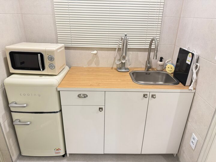
A Spoonful of Butter to Gray & White 🧈 #WarmToneInterior I decorated the accommodation I personally designed using ivory and butter colors throughout. Although it is a small space, I wanted it to feel warm and comfortable during the stay, so I paid close attention to the lighting colors, overall tone, and mood. Actually, there is quite a bit of gray in it, but I think the butter color softens the tone. I placed an ivory chair and a white table in the living room, and a cream-toned refrigerator and microwave in the kitchen. I added warmth with a dining table light featuring wood accents and a kitchen countertop. I like that even though similar colors are grouped together, the materials and shapes differ, so each space has a slightly different atmosphere :) 🧈 4 Things to Keep in Mind When Decorating with Ivory & Butter Tones ① Keep Large Areas Bright and Calm I used subtle colors like gray or ivory for walls and large furniture, and added butter colors for chairs and appliances. ② Look at How They Look Together Rather Than Just the Color Names Even within the same 'cream' shade, there are differences in yellow undertones and gray undertones. Comparing actual review photos before purchasing helps gauge the color combination. I made my choice by searching through reviews over and over again, comparing them to see how the colors would look when placed together in person! ③ Connecting Warmth with Wood I utilized wood for the kitchen countertop and the dining table light. Since the same material is used throughout, the living room and kitchen feel like they connect naturally. I even added a touch of wood to the tissue case! ④ Checking Colors When the Lights Are On Ivory and butter colors can appear yellower depending on the lighting. It is a good idea to check the colors both day and night to match the atmosphere you want! Having decorated it myself, I found that for warm-toned interiors, rather than matching every item to the same color, adding warm colors and materials little by little to a main tone seems to reduce the risk of failure. Especially since the accommodation I decorated was small, I adjusted things to ensure I could check the dimensions and simplify the items even more. If you are preparing an ivory or butter-toned space, save these and refer to them when choosing color combinations 👀 #IvoryInterior #버터컬러 #크림인테리어 #작은집인테리어 #숙소인테리어 #셀프스타일링 #구축리모델링 #주방인테리어 #거실인테리어 #식탁조명
- 1d
- Likes
- 7
- Saved
- 3
- Views
- 5
Comments0
